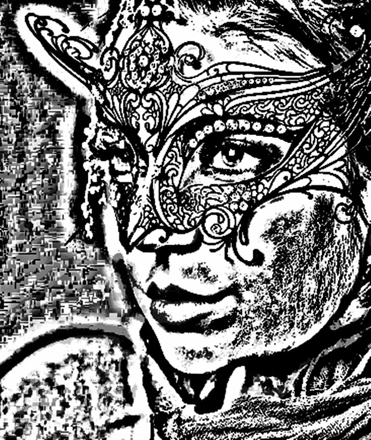
These first two edits I chose to use a dark blue and light blue. The first edit is in a block dark blue colour, which nicely accentuates the detail on the mask as well as fading out the detail of the hair and clothes.
For the second edit I mixed the watercolour and coloured pencil effects together in order to create more pastel tones for the portrait, which in turn added lighter blue hues to the eyes, mask and clothes.

 The last two edits I've created in black and white. The first one is a mixture of an imprint and charcoal effects, which created an interesting and slightly blurred background effect, whereas the second one is a pencil drawing effect in which I raised the pencil thickness in certain areas and lowered it in others.I think these edits beautifully enhance the detail of the masquerade mask, as well as emphasizing the detail of the eyes and portrait in general, as well as the direction of the subject's gaze.

No comments:
Post a Comment